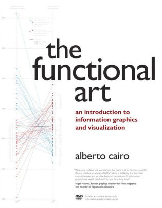
Like many of us, Alberto Cairo is a polls-junky. Whenever election season comes around, he gets locked into the numbers. But for Cairo, it’s not just a seasonal passion; he’s devoted his academic studies to graphical representations of data in news media. Currently, he teaches data visualization at the University of Miami.
Cairo became interested in data visualization after a professor noticed his ability to create quick, rudimentary sketches. The professor recommended Cairo for an internship in a graphics department for a newspaper in Spain. He was unfamiliar with data visualization when he started, but loved the field after the internship. Since his college days, he’s written two books on the subject and runs a blog called The Functional Art.
On April 15, 2018, Cairo will deliver a talk called “Visual Trumpery” at the Ohio State’s Science Sundays lecture series, a free and open to the public event. Cairo initially called the talk “How Charts Lie,” but thought it was too dull and didn’t have the draw, so he retitled it to include the word trump, meaning showy but worthless, because it’s related to the current president’s name. However, he asserts the lecture is relatively bias-free and draws on bad graphs and data from the right and the left. His primary goal is to show people how to spot the fake data and charts and to teach people how to create better, more accurate visuals.
Cairo likes to talk about percentages and how they translate to a graph. He mentions that at some point during the 2016 election, Donald Trump had a 17% chance to win the election. This statistic seems low but Cairo likens this to rolling a “1” on a six-sided dice. Cairo believes including examples like this on charts will help people discover more interesting things and understand the magnitude of data.
According to Cairo, the world of charts and graphs is simultaneously improving and getting worse. Because of the Internet, there’s a lower barrier of entry to creating and disseminating charts and graphs, which means anybody can make a figure that says anything they want. However, reputable news magazines on the right and left are using these tools to create better data-driven charts and stories.
Listen in for more about visual trumpery and then attend Professor Cairo’s talk.
Podcast: Play in new window | Download
 Ohio State University alum Michael Kardos had a problem. How could he keep his son busy while he was writing? The solution: promise to write story chapters for his son if he played quietly for a time. In a classic case of unexpected benefits, Kardos discovered that writing for his son made him realize the importance of writing for a sense of wonder.
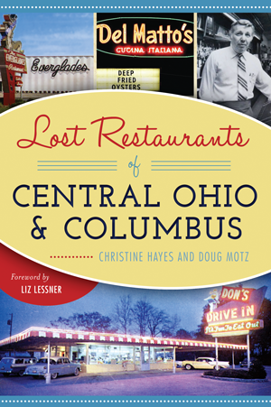 Christine Hayes is a Columbus native and columnist for the Short North Gazette. You might know her as Ramona Moon, the art car lady. Aside from gluing toys to her car, Hayes has edited a book of her father’s old newspaper columns and cowritten two books about Ohio’s lost restaurants. On this episode of Craft, Christine talks with Adam Hribar about some of the missing eateries of her childhood and what’s changed since she ate out as a kid.
 Yo ho! Yo ho! It’s the pirate’s life for Steve! Ever since Steve Goble was a kid, he’s been enthralled with the adventure novel. Since he couldn’t be a pirate, Goble became a reporter for ten Ohio news publications and has written everything from crime reports to craft beer reviews to poetry. He has one book out now and is set to publish his second one, The Devil’s Wind, in September 2018. On this episode of Craft, Steve talks with Adam Hribar about his first book: The Bloody Black Flag: A Spider John Mystery.


 Want a Marvel-DC cross-over on the silver screen? Well, the studios probably can’t hash out that legal mess, so you’ll have to settle for watching two radio shows collide.
